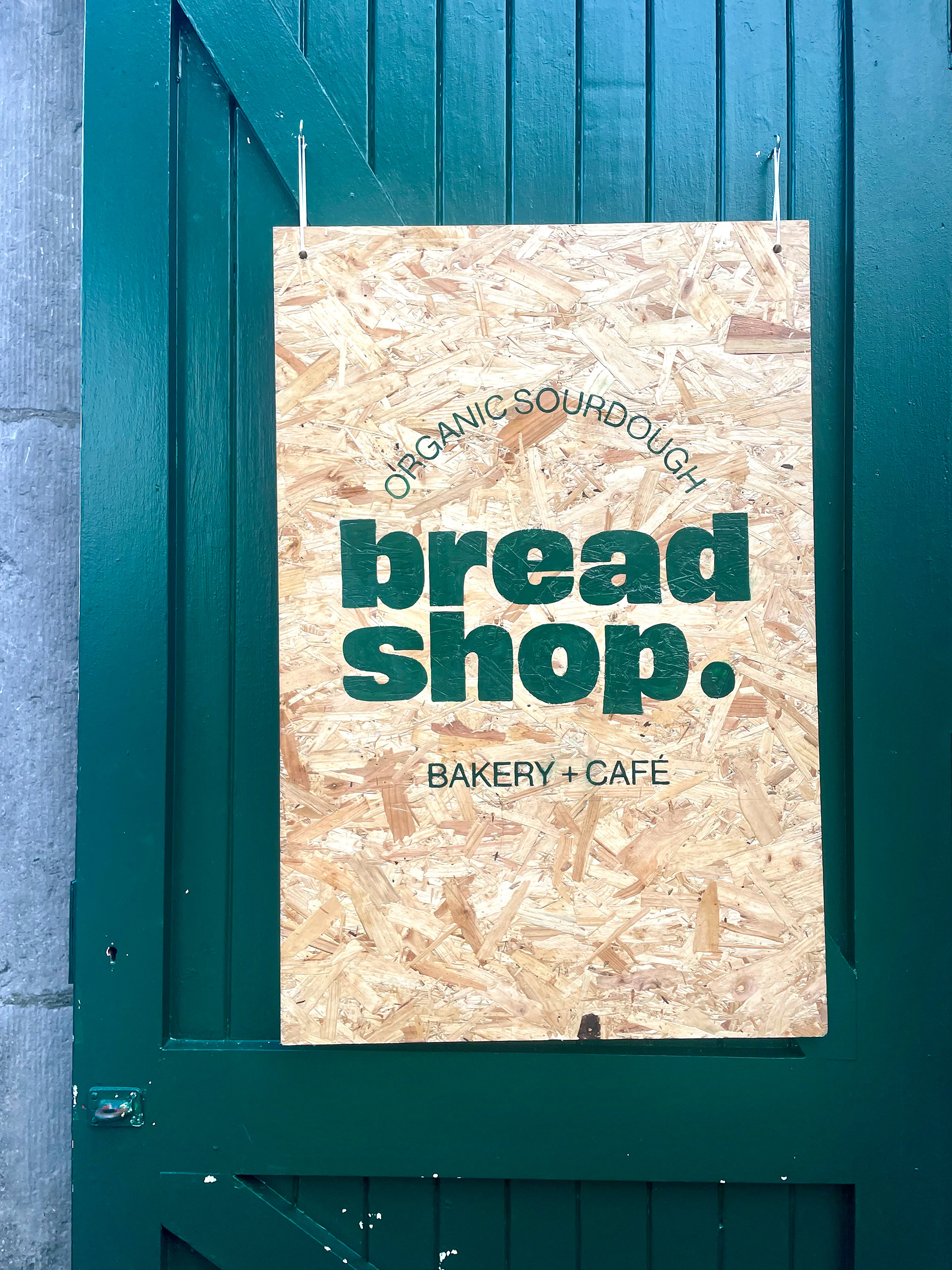
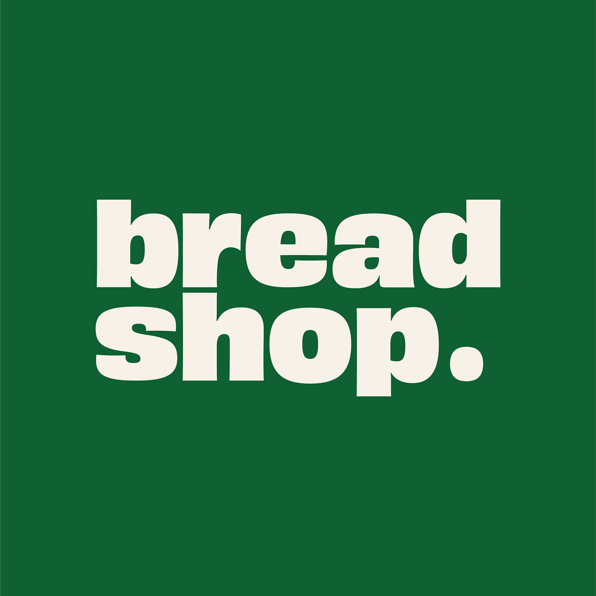
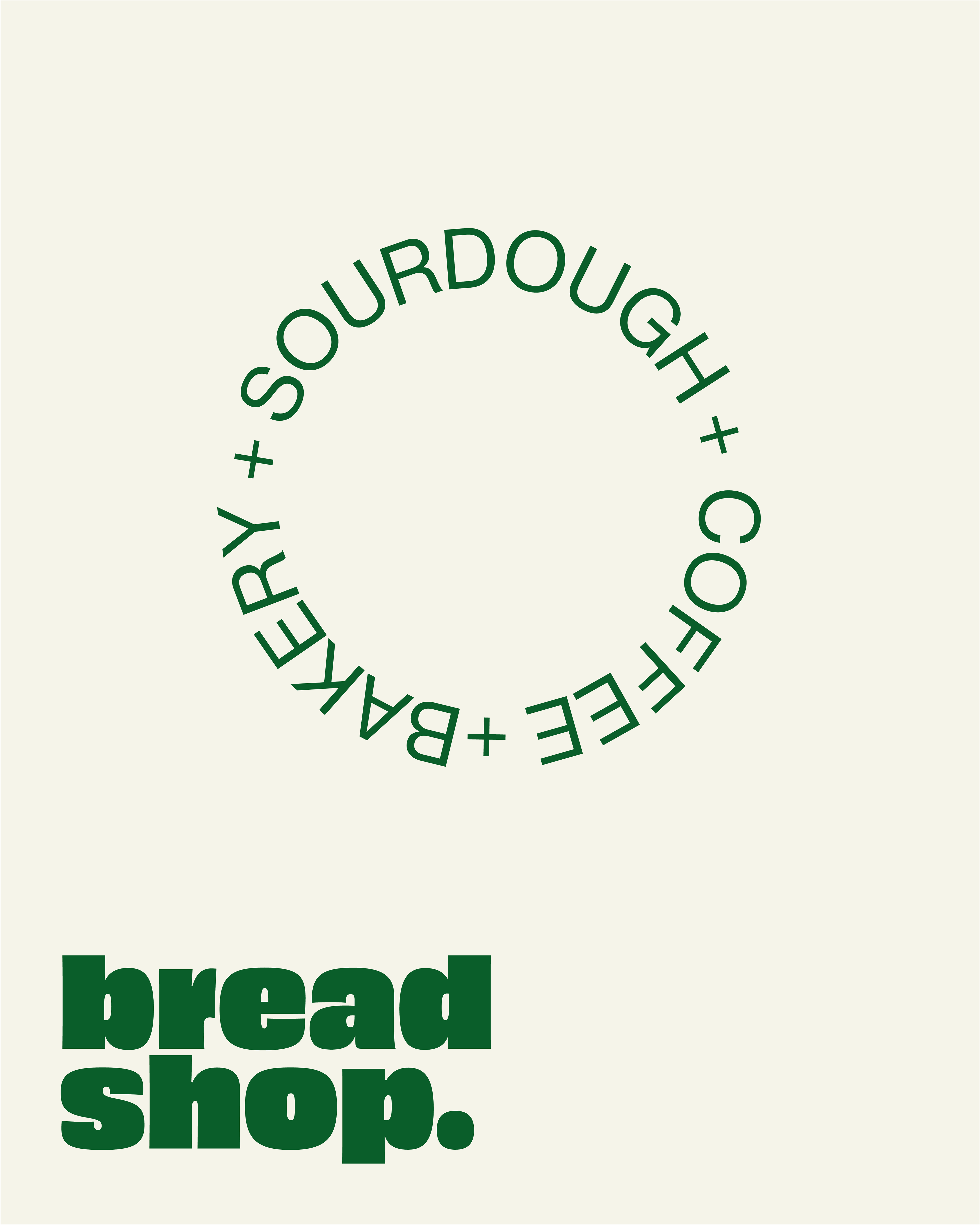
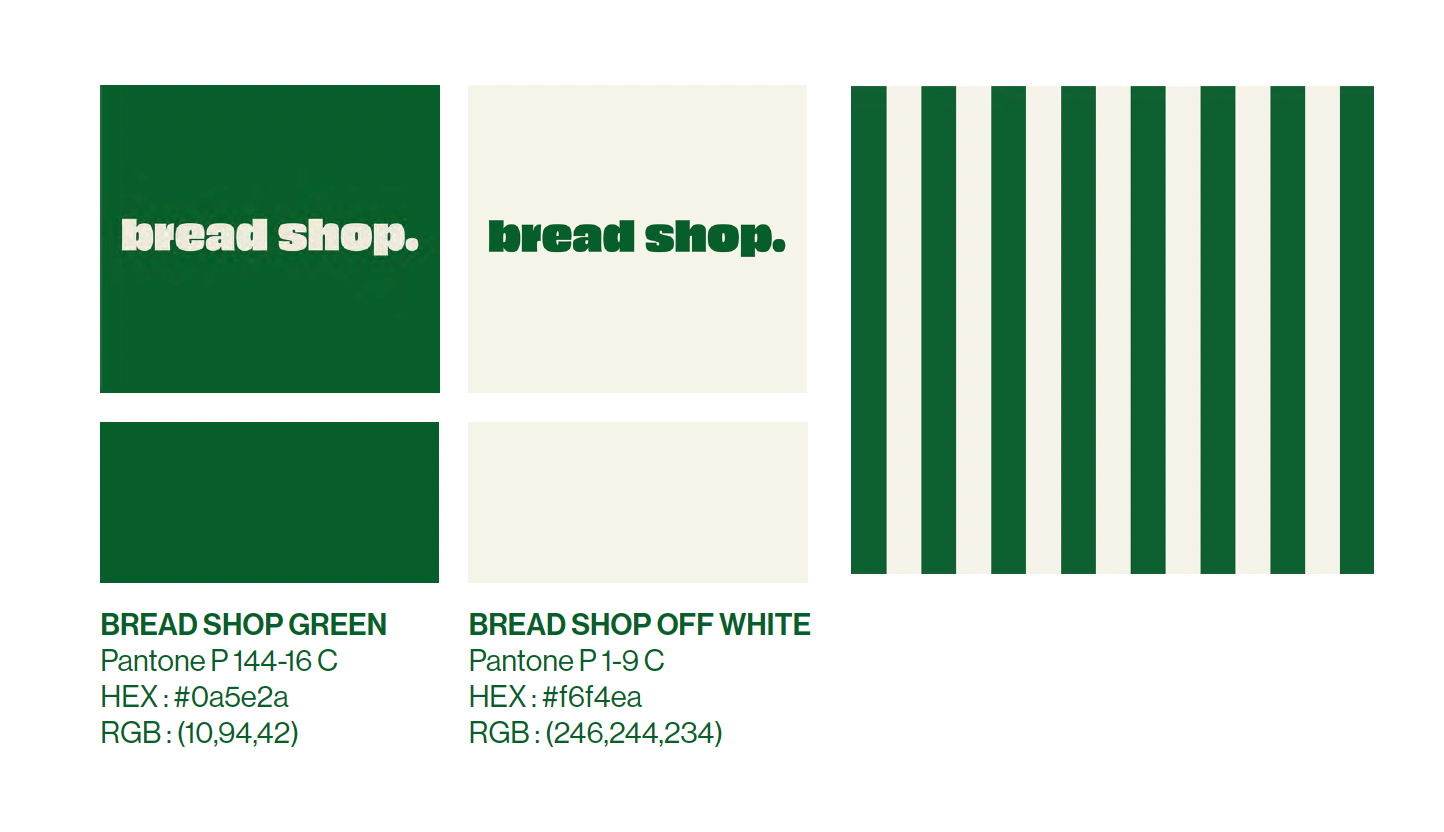
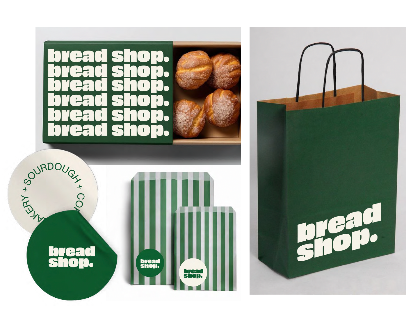
Racing Green and a soft, warm white reflect Bread Shop’s pride in Irish produce and its renowned sourdough bread, paired with a rounded logotype and full stop to communicate their focus on what truly matters: great bread, good ingredients and community. We incorporated vertical stripes as a subtle nod to Canteen’s signature use of horizontal lines in their branding.
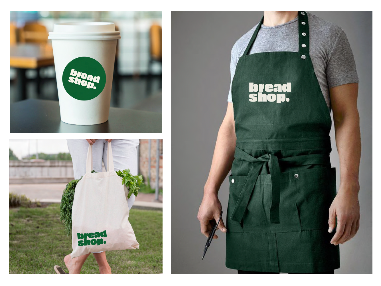
Brand elements are applied sparingly, reflecting a stripped-back, purposeful aesthetic. This isn’t a brand focused on merchandise or making noise online or in their phyical space.
Instead, the goal is to quietly cut through the clutter - standing out in a neighbourhood saturated with baked goods and coffee, not by shouting, but by speaking clearly and with intent.
Using leftover paint and wood salvaged from the café counters, I hand-painted a sign.
Weathered, warm, and quietly inviting.